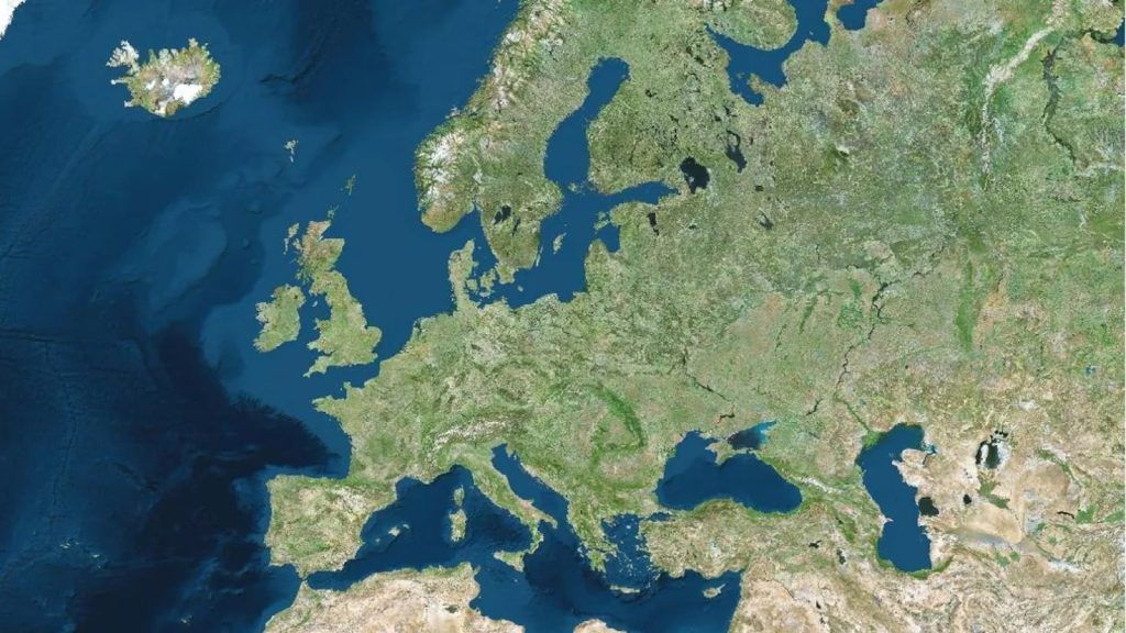
The Mercator Projection means that we do not see countries in their real size on traditional world maps.
If we have ever been tempted to compare the size of the countries in the world thanks to a conventional map, we could not be more wrong. The Mercator projection makes us see them in a distorted way, or as the definition of the Virtual Science Museum explains…
“The Mercator projection was devised by Gerardus Mercator in 1569. The most important feature of this projection is that the system of meridians and parallels is transformed into a Cartesian coordinate system, straight lines that intersect perpendicularly”.
To solve this distortion, we can take a look at The True Size Of portal, which allows us to compare different countries in a very simple way: searching for each one, dragging and superimposing it with the one we want. This is how Spain (more than 505,000 square kilometers) would look, for example, compared to the United States (almost 10 million km2).
And the deformation at the poles creates such a significant distortion that, if we look at a conventional world map, we might think that Greenland is a little smaller than Africa. However, if we compare both territories in The True Size Of we see that The African continent is actually much larger:
It may interest you…
Follow the MeriStation channel on Twitter. Your video game and entertainment website, to find out all the news, updates and breaking news about the world of video games, movies, series, manga and anime. Previews, analysis, interviews, trailers, gameplays, podcasts and much more. Subscribe!